TEKUNO PACKAGING
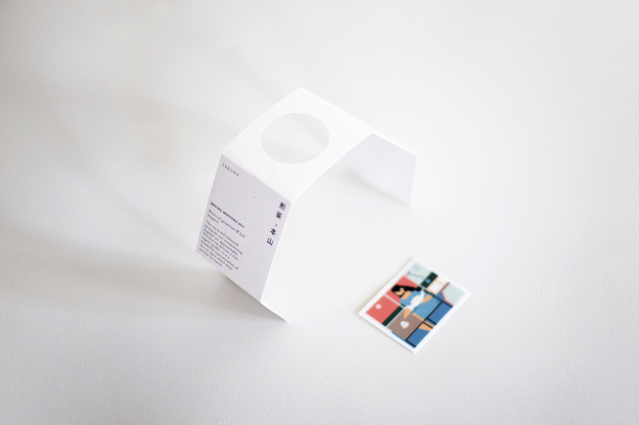
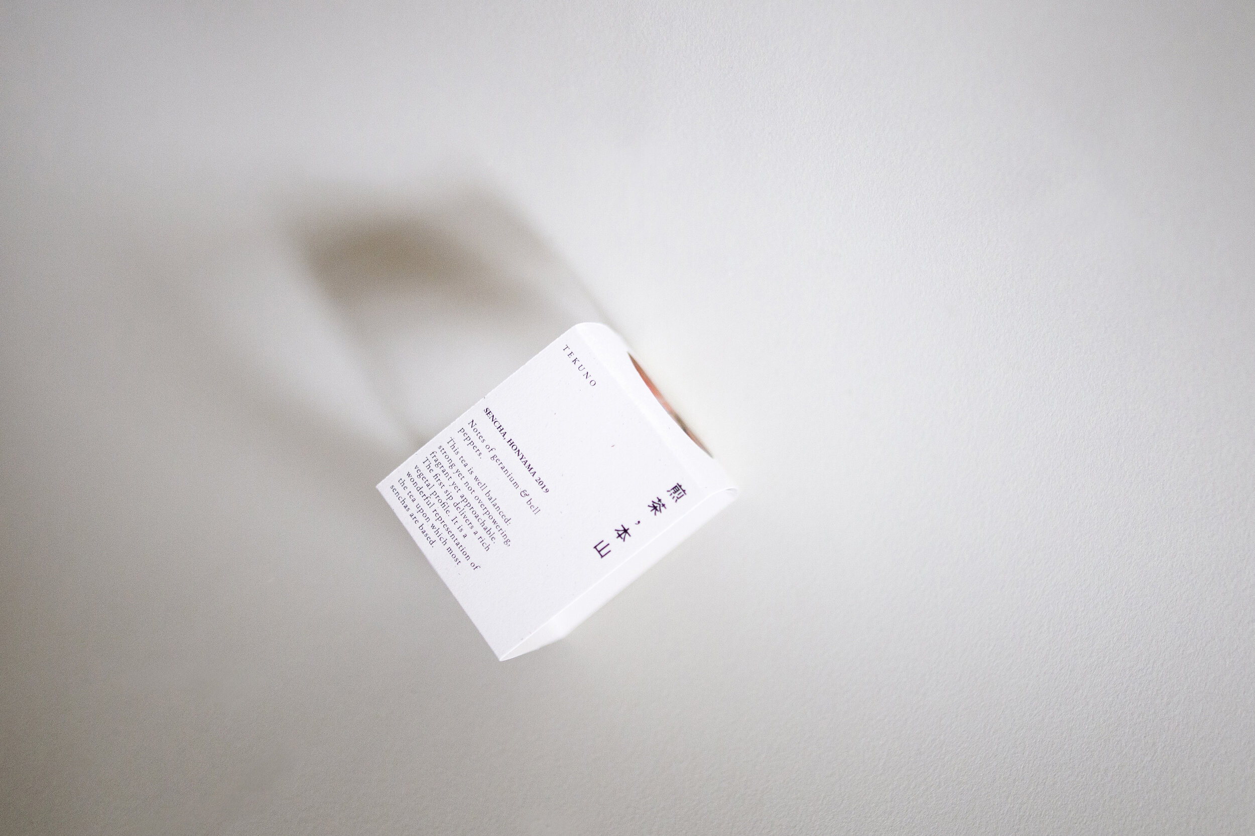
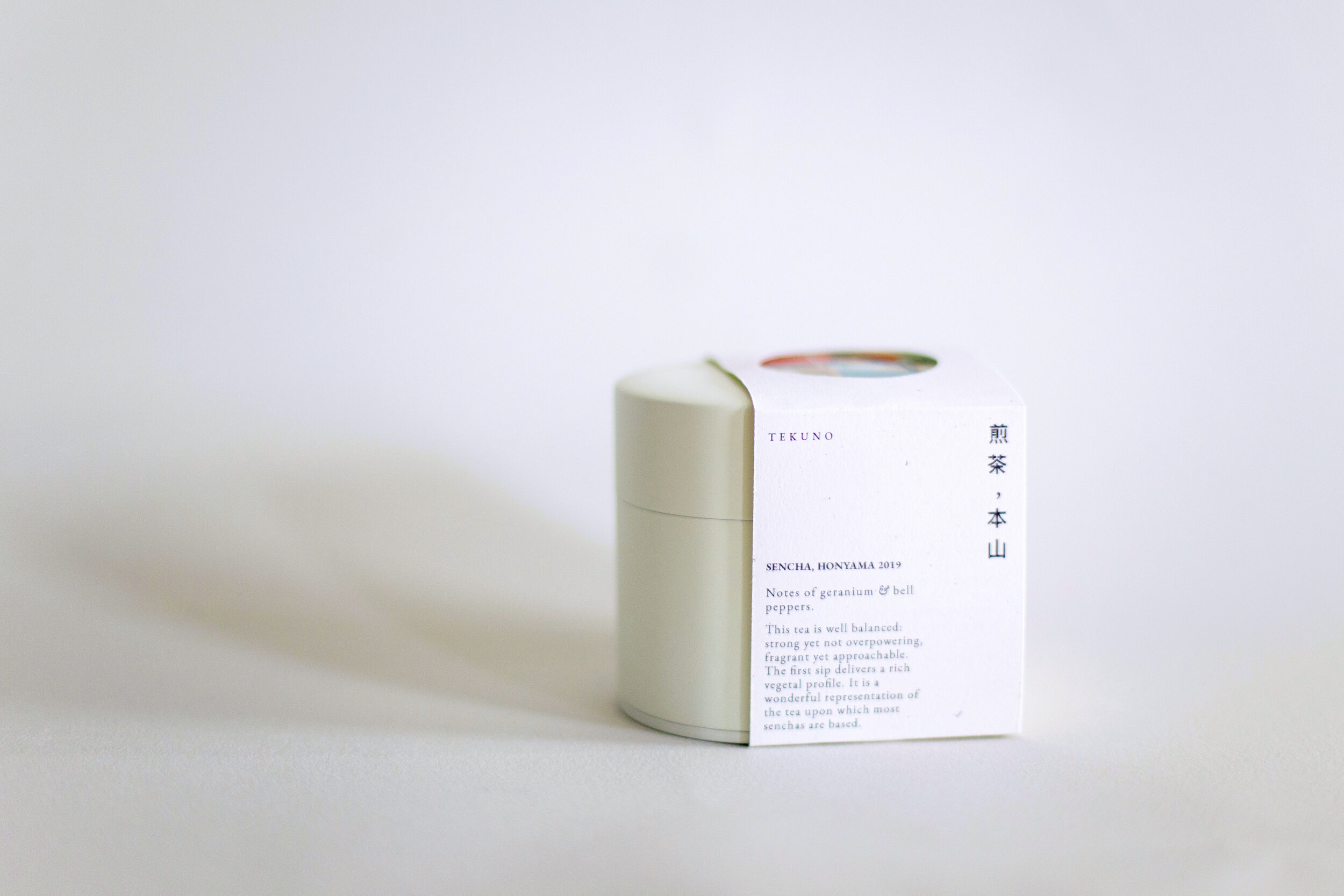
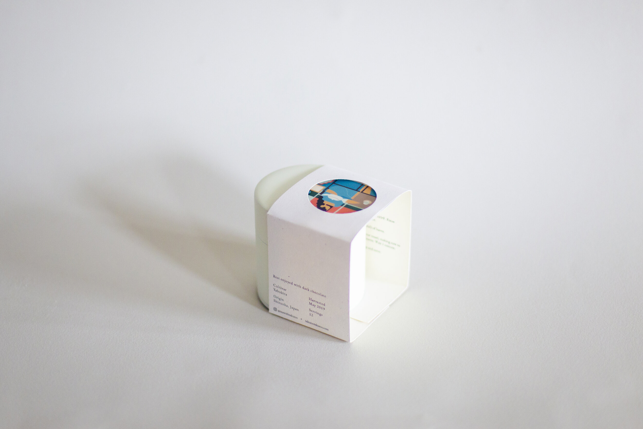
When I met Cat, she already had art and brand standards for her tea company, Tekuno. She was in the process of transitioning to a Japanese tin however and wanted to explore new packaging. Drawing from my background in architecture, the final packaging resulted in a three dimensional envelope which brought together the type design of Patricia Lee and the artwork of Adrian Wong
With a general idea that the packaging would involve art and text, I sketched different packaging geometries that could support the content
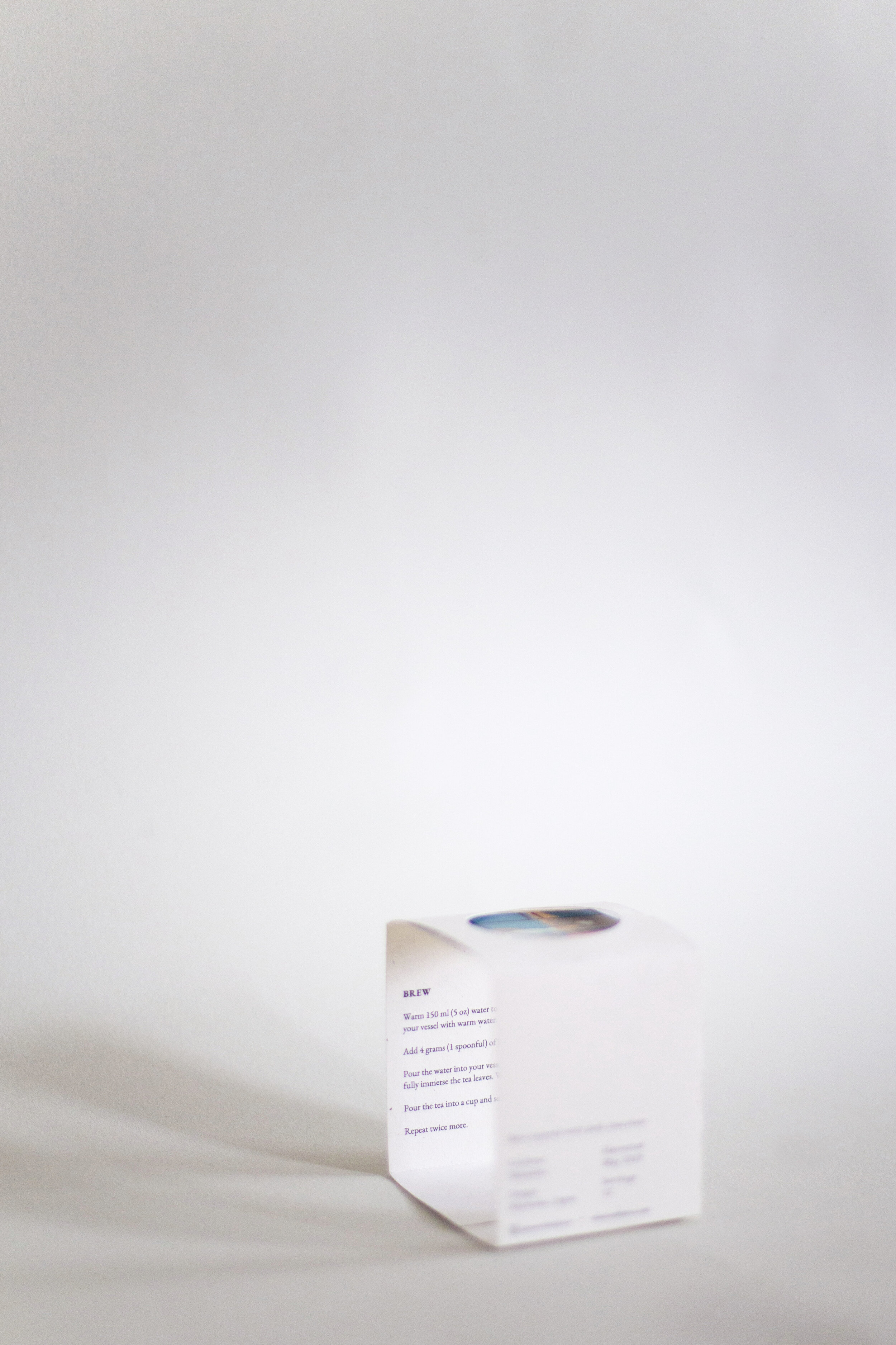
Once the geometry was chosen, the process of putting all the pieces together began. Her slogan of ‘Teas for quiet moments’ became cemented in my head so I wanted the packaging to also be ‘quiet’ and intentional. I separated images and text, giving the packaging an uncluttered feel while also allowing the user to rotate the tin and find something intriguing on each side.
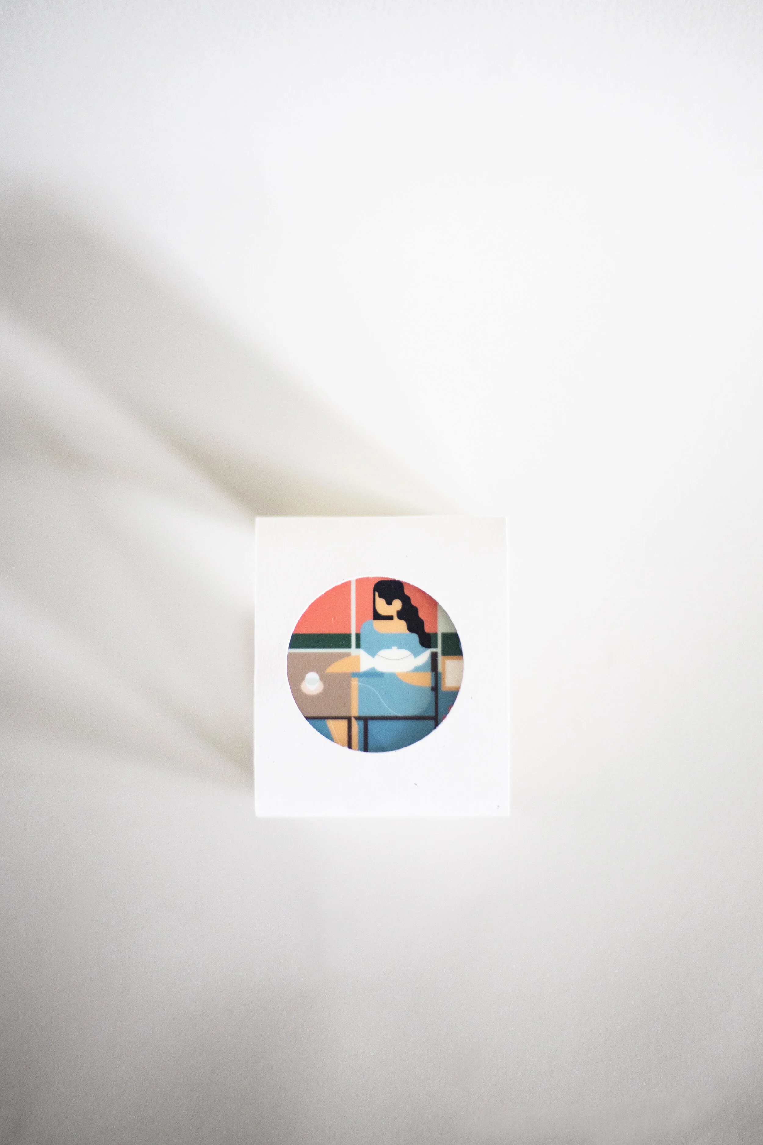
To intrigue the viewer and make them want to engage with the product further, I proposed a circular opening at the top of the package which would reveal some of the art, while leaving some of it hidden until the packaging was completely removed. To test the idea, I created a quick mockup before heading into the final version.
packaging mockup
